The typeface I NEVER READ is the end result of my Bachelor thesis in Visual Communication at Bergen Academy of Art and Design (Sept. 2015–Feb. 2016). The modular typeface challenges the traditional letterforms with the intention to explore how added friction and reduced legibility can increase the visual interest in a text. The over all intent is to achieve a reaction that renders reflection over the perception of type as a communicative tool.
Excerpt from the written thesis:
It is suggested that human reasoning involves two distinct processing systems: one that is quick, effortless, associative, and intuitive and another that is slow, effortful, analytic, and deliberate. System 2 processes are activated by metacognitive experiences of difficulty or disfluency during the process of reasoning. Incidental experiences of difficulty or disfluency—receiving information in a degraded font and difficult-to-read lettering—reduce the impact of heuristics and defaults in judgment (Alter, Oppenheimer, Epley, And Eyre, 2007).
When faced with typography that is less legible, the reader is forced to slow down to more sharply focus their attention and consequently improve their attention span and perception of the content before them. This again might force the reader to engage more deeply with the written material and thus enhance comprehension and encourage deeper processing.
Client: Student work (Bachelor thesis)
Year: 2015–2016
Year: 2015–2016


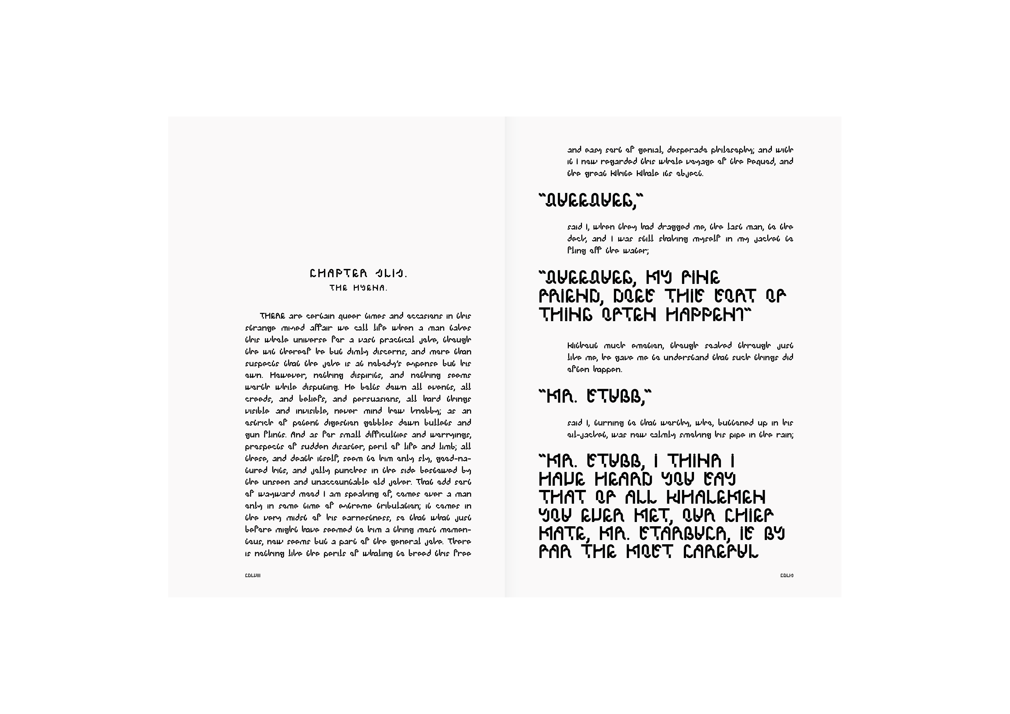
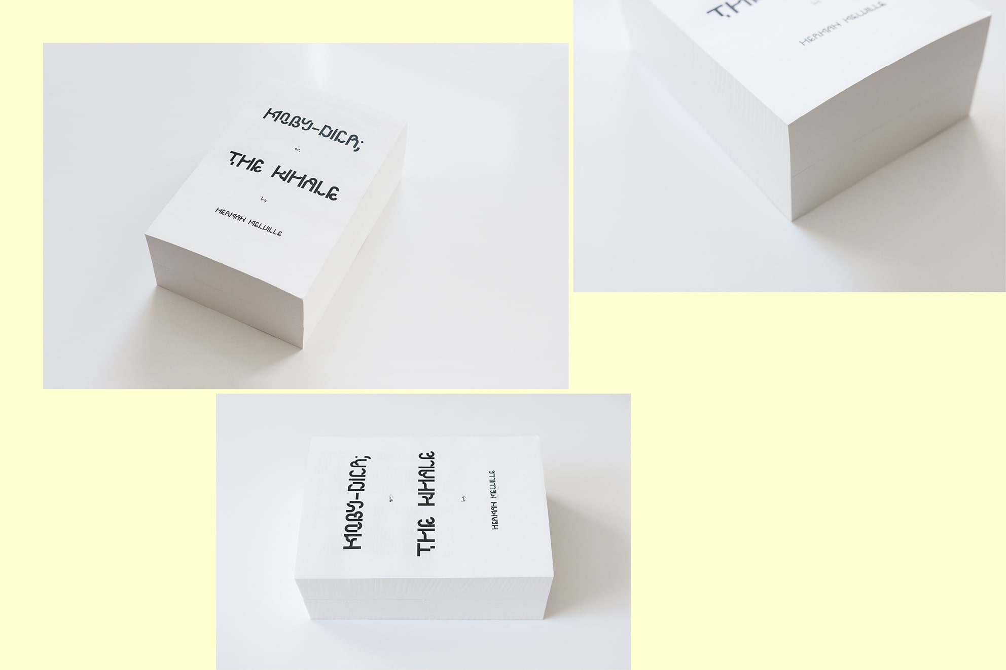
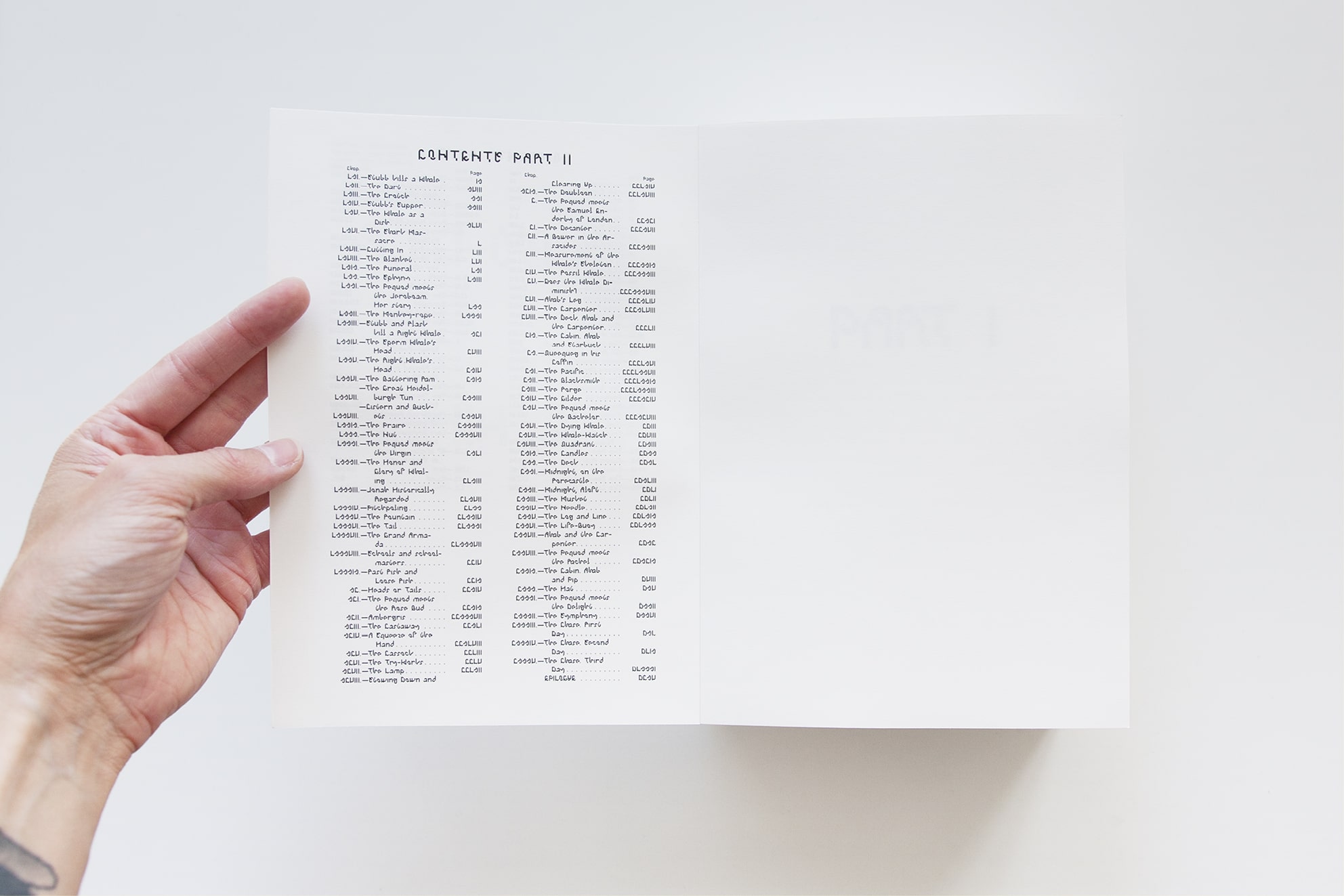
In order to showcase the versatility and diversity of the typeface, it was displayed in different contexts and media during a Bachelor's exhibition in Bergen, Norway. Posters, flyers, business cards and digital platforms were all a part of the exhibition, and the entire Moby Dick was redone in I NEVER READ for the occasion. The intent was to create interaction between the audience and what was exhibited. I wanted the audience—by touching, reading and picking up—to be activated and engaged in the exhibition.